Troy officials table possible new downtown branding, signage after discussion
 By Charles Bolinger
Editor • To market the city’s mission to build on the downtown core and using placemaking signage, Troy City officials proposed new branding and signage for the area during an April 20 administrative and community services (ACS) meeting at city hall.
City Administrator Jay Keeven and City Engineer Tom Cissell submitted some ideas for a new welcome sign in Paul Simon Park, where Main Street and West Clay Street intersect. They also turned in some new banner ideas that would hang on city utility poles for part of each year. The new logo would also appear on all city communications – website, stationery, etc.
“We wanted to add some branding to our downtown with our streetscape,” said Cissell. “We hired Arcturus as an architect to help us through this process.”
The city’s current logo will remain intact but one of the conditions Keeven and Cissell had for any new logo was that it must pair well with the existing one. Their preference was for a blue and green color palette.
First, they showed the city council some initial candidates.
“We were looking for a Downtown Troy brand,” Cissell explained, showing a grouping of 12 potential logos first. Many of them had the O in Troy as a photo frame for a tree or some other element. He said they took inspiration from last year’s First Friday events, a set of events hosted by the Troy-Maryville Chamber of Commerce.
They decided to use the city’s tree as a springboard so the logo with a tree on the left was a keeper at this stage.
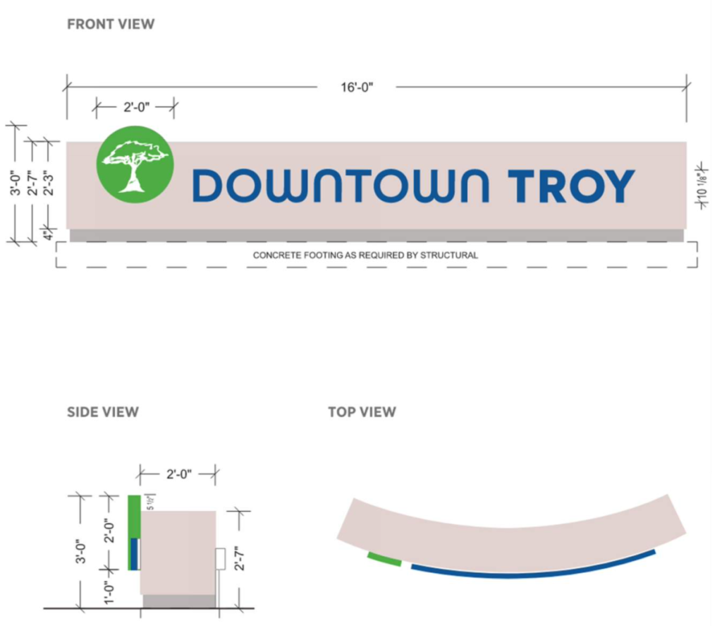
Cissell said Councilman Tim Flint also approached them about a gateway sign. Cissell and Keeven thought it would be a good idea to put a welcome sign at the western entrance to downtown with a modern style and font and have it backlit as opposed to aiming spotlights at it.
As for the utility pole banners, Cissell said he didn’t like the color of the initial one so he asked the company to re-work it. Arcturus came back with some semi-finalists: the tree element alongside Downtown Troy in a sans serif font. They brought forth four additional banners, too. They also trotted out four concepts for the welcome sign.
Then it came down to the finalists. The city’s logo finalist was shown in black-and-white as well as color since both would be needed, depending on application. They selected a banner that sported a blue background, the tree lit in green at the top, with Market and Main streets highlighted within a white circle near the bottom. Then they showed a curved welcome sign style that they chose. The green tree circle on the sign’s left would light up along with the words “Downtown Troy” backlit.
The welcome sign would cost the city $35,000 alone and could be erected later this year as part of the streetscape, Cissell said.
Councilman Troy Turner asked, for branding purposes, if they could remove the word Street from Main, then he asked if they could swap out Market and Main with Downtown Troy on the banners along with a tagline of Eat, Play, Stay.
Instead of the tree, it would say Downtown, then Troy, followed by Eat Play Stay as you went from top to bottom. Turner also commented that the welcome sign resembled a bank sign.
Councilwoman Heather Stirling questioned using Market and Main in the logo, considering the new restaurant on Main Street uses that same name and she did not want anyone thinking they’re related. Cissell noted this project predates the restaurant.
In the end, the banners will need revision, along with Eat Play Shop as a potential tagline as well as the welcome sign. Keeven said on April 24 that he and other officials plan to look at additional options and bring them to a future meeting.